Magazine Ad:
|
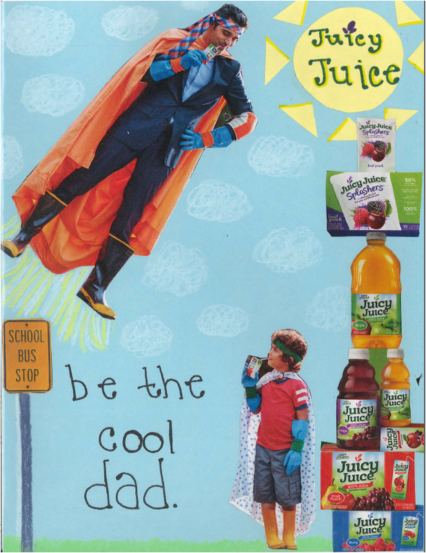
Here is an advertisement that the class was assigned to create. Our assignment was to create an ad using paper, writing utensils, scissors, glue, and magazines. I created an ad for juice, directed toward children and their parents. I use multiple ads from a magazine and neatly cut around the images I selected. I placed the images and writing on the construction paper based on what I learned. The intent of this assignment was to use elements and principles (color, line, balance, and emphasis) to create an ad. I learned about the elements and principles and how to use them. I also learned how to scan an image and how to use the image I scanned. |
Windshield Flyers:
The assignment was to create a business flyer to invitation to an event. We were to decide where we would be distributing these and who our demographic is when designing our flyers. We need to think about possible colors, images, and styles to reach our demographic. We need to give people the necessary information of who, what, where, when, why, and how. I designed my ad using the Elements and Principles of Design that was discussed in our first project.
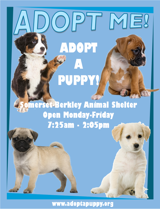
The first assignment was to create a flyer using a template from the design gallery. I chose a template and changed the colors, placement, and text. I chose to make a flyer about a pet adoption. I used word art for the title and I saved images from the internet and inserted them into my flyer. I was trying to reach people who were looking to adopt a pet with my flyer. I am advertising a pet adoption. I also included the location, time, and a website to direct the audience to more information. I used color and contrast to direct the audience's eye to certain places on the flyer. I also used images to catch the audience's attention. I included the elements and principles I learned in class to design the brief windshield flyer.
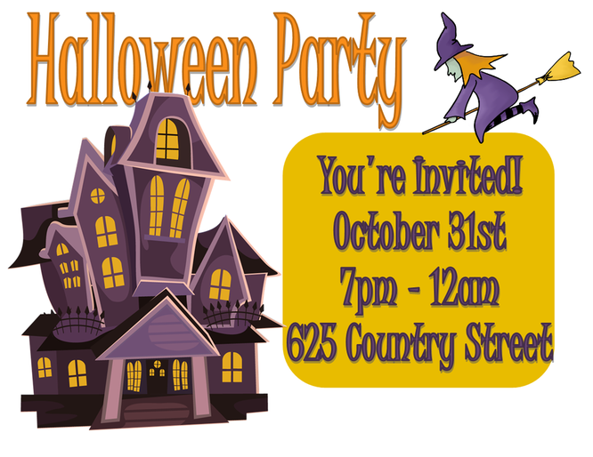
I began this flyer with a blank documents. I selected landscape orientation 11x8.5'. I used shapes, lines, patterns, and images to create my own design. I created a flyer for a Halloween party. I used color to direct the audience's eye to the information needed to attend the event. I used an image to catch the audience's attention. I also used a bold title and lines for the title. I overlapped shapes, images, and text to add a creative and eye-catching effect.
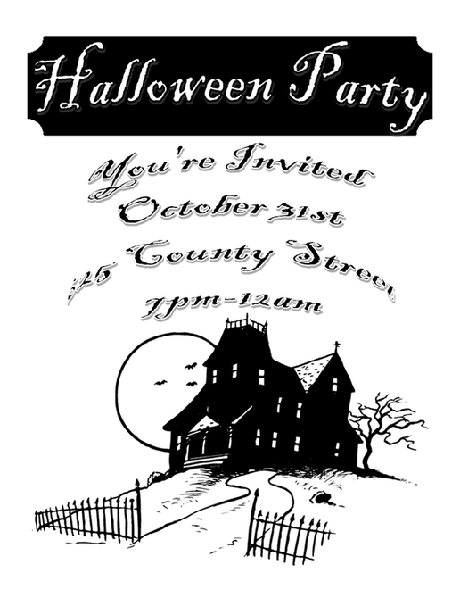
In the third and final flyer, I completely re-designed the first and second flyer only using black and white. The flyer included the same information. I set up the flyer in a completely different way. I used a different layout. I set up the flyer in a portrait orientation 8.5 x 11". I used different fonts and a different image. I used shapes, lines, patterns, and images to create an eye-catching flyer without using color.
Tri-Fold Brochure:
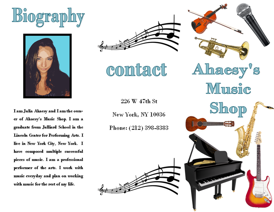
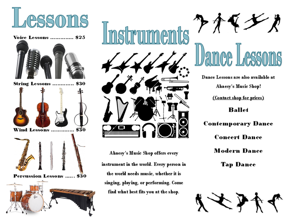
I created a Tri-Fold Brochure. The class was expected to create a brochure advertising our own imaginary company. I created the company "Ahaesy's Music Shop." The class needed to provide a biography, including fictional information about ourselves and a picture. We learned how to transform a picture of ourselves in Photoshop to make it look like it is not a photograph. Contact information was required to be placed on the back of the brochure, which we learned would be the center column of the title page when folded by a machine into a tri-fold. In my brochure I advertised a variety of lessons and instruments on the inside. I added several pictures from the internet and placed them onto my project. I used Word Art and changed the font and color. I organized the materials and information. I experimented with multiple possibilities while working on the assignment to demonstrate creative thinking. We then learned how to print double-sided and use the folding machine.
Greeting Card:
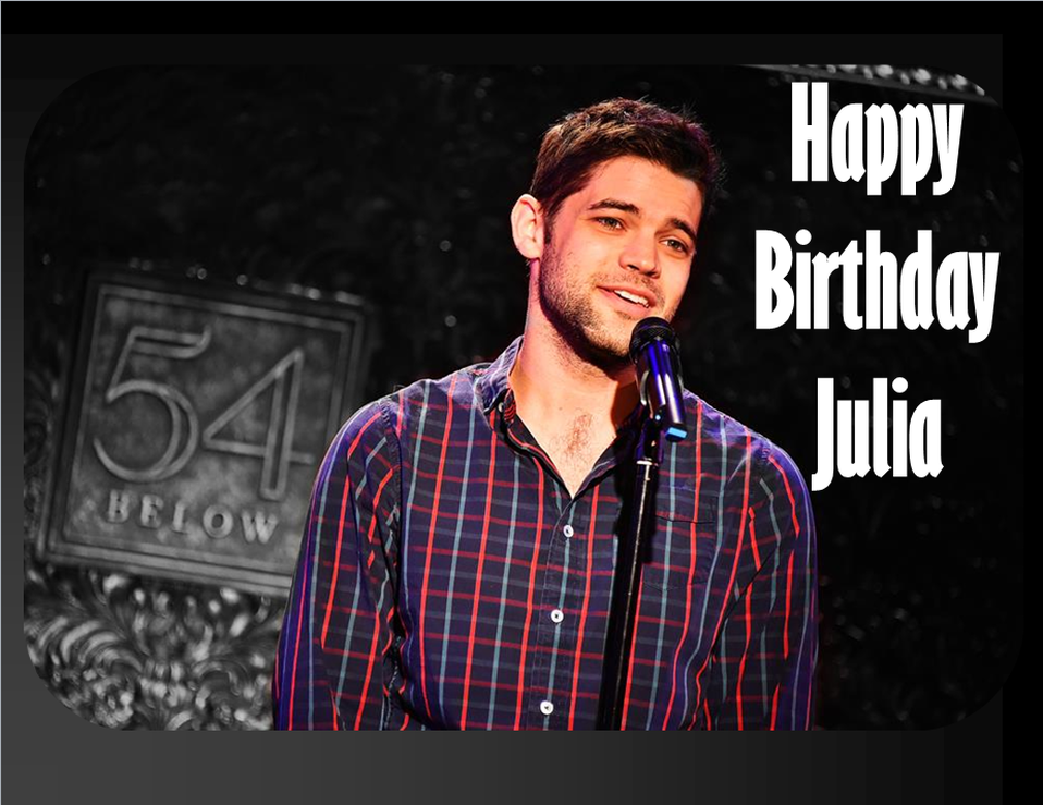
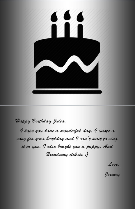
Our class was assigned to create a greeting card from a celebrity, addressed to us. I chose to create a birthday card from Jeremy Jordan to myself. I first found an image and inserted it into photoshop. We were required to make five edits to the image. I first adjusted the saturation of the image. I then made the image gray scale. I used the history brush to add color back to Jeremy. I then used the blur tool to blur the background of the image. Lastly, I adjusted the brightness of the image. After all the edits I saved the image and inserted it into a greeting card template. I changed the background of the card, the shape and size of the image. and added word art to the front. On the inside of the card I changed the background, added an image, inserted a text box, and inserted a message. On the back of the card, I inserted a text box and added text. After the card was finished, I printed my card and folded the paper.
|

|
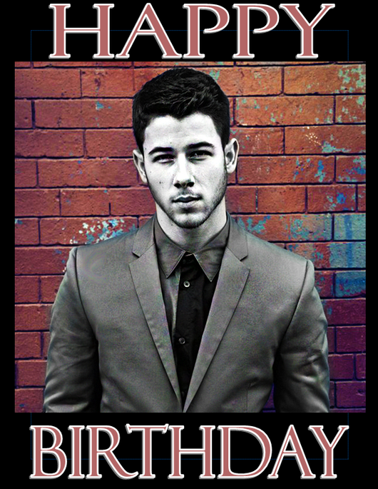
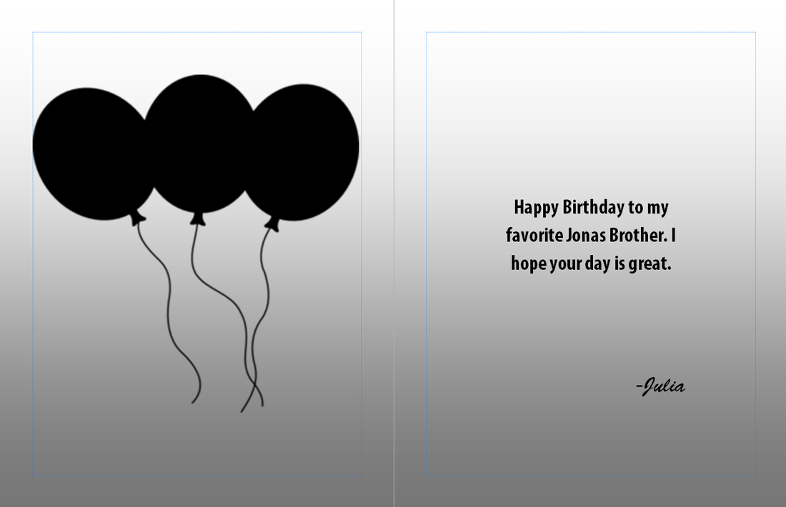
Our class was also assigned to create a greeting card from to a celebrity, addressed from us. I chose to create a birthday card to Nick Jonas from myself. I first found an image and inserted it into photoshop. We were required to make five edits to the image. I first made the image gray scale. I used the history brush to add color back to the backgrounf. I then adjusted the vibrance of the image. I then used the sharpening tool to the center focus of the image. Fourth, I placed the grain filter onto the image. Lastly, I adjusted the brightness of the image. After all the edits I saved the image and inserted it into a greeting card template. I changed the background of the card, the shape and size of the image. and added word art to the front. On the inside of the card I changed the background, added an image, inserted a text box, and inserted a message. On the back of the card, I inserted a text box and added text. After the card was finished, I printed my card and folded the paper.
|
|
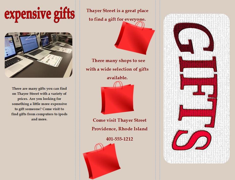
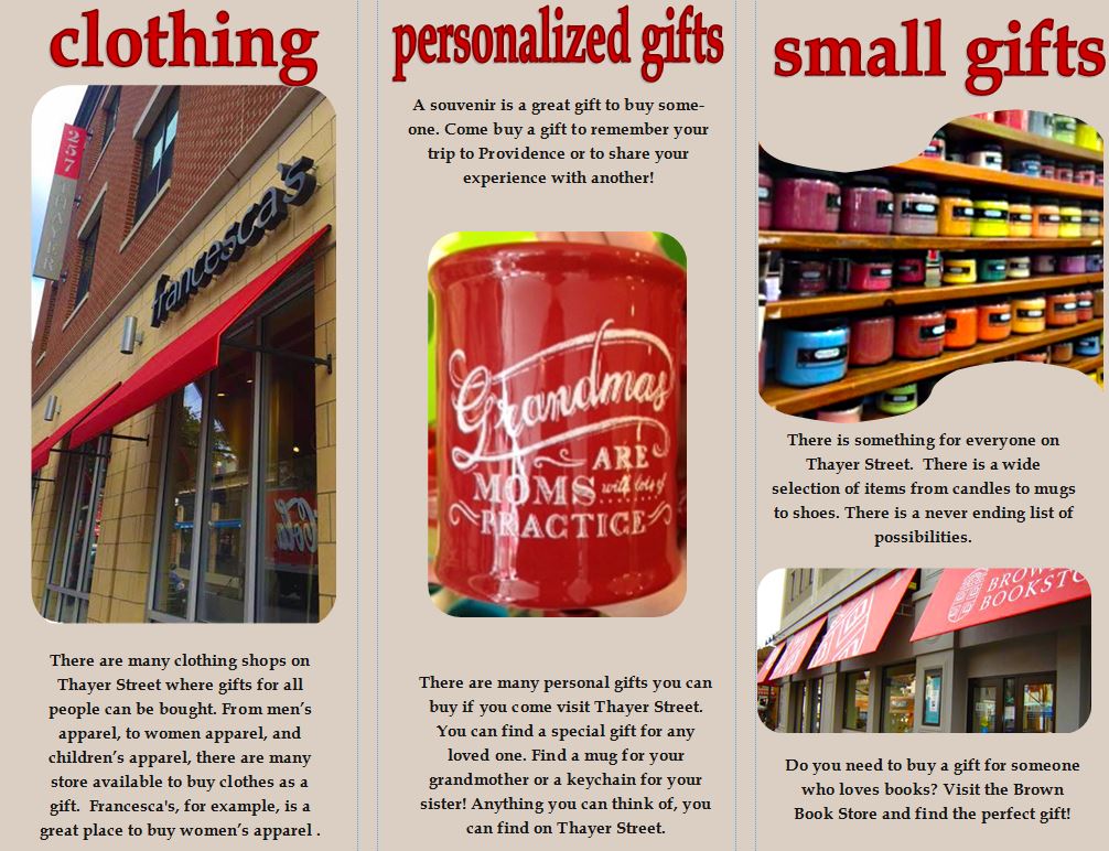
Thayer Street:
The class went on a field trip and visited Thayer Street on October 28, 2016. The class made connections to future careers and real life experiences in and out of the Graphics curriculum. The class was expected to take pictures of businesses and items relating to the subject we were given and to learn about the businesses and how to advertise our subject. We were then expected to create a brochure based on the specific subject. My subject was "gifts." This tri-fold brochure assignment did help me in the future when thinking about subjects such as classes, college, careers, or personal projects. I started my brochure with a blank, landscape document and divided the paper into three parts. I saved pictures I took, pictures others took, and pictures from clip art and edited every picture in Photoshop. I then inserted the pictures and shaped the photo border. I included different sized text to organize headings and information using text boxes and word art. I changed the page color and the color of the text. I also created my own title on the cover page using Photoshop. I changed the color of each letter, changed the saturation, and added a filter from the filter gallery. All in all, this assignment and field trip was a great learning experience.